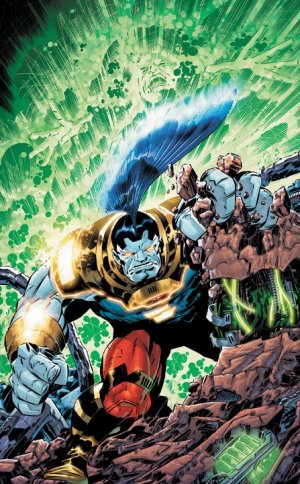
 I am going to preface this review by going on the record, to state that I did not enjoy this issue. Not to say that there were not some nice elements in both the writing and artwork, things just did not come together in a way that I found enjoyable. The issue itself seemed to commemorate the character’s creator, Jack Kirby, and apparently had no further goals. Plot development was not present, and the main protagonist, O.M.A.C., was a brute with the sole function of obeying a mysterious force (revealed to be Brother Eye).
The story opens on the offices of Cadmus labs where a pitifully annoying woman is complaining about her boyfriend’s lack of ability to make a lunch date (this is the reason I buy comic books. Solid gold). Suddenly, security busts through the door, ordering an evacuation as a giant blue abomination (O.M.A.C.) enters, rather awesomely, through the wall. Unfortunately this wall busting is overplayed throughout the rest of the issue, making the reader feel as though the Kool-Aid Man filled himself up with blue kool-aid instead of red that day. The protagonists only drive is given to him via orders from Brother Eye, directing him to the basement in order to access a mainfraim of information. This sorely underwhelmed me by making the focus character of the comic entirely void of any emotion or thought process other than “opposition”, “out of my way” etc. When his task is finally completed, O.M.A.C. is teleported into a desolate desert, reverted back to his host body form (revealed to be Kevin Kho, the missing boyfriend from the beginning of the story) and is contacted by the incredibly stylishly designed Brother Eye (sarcasm… he’s a Frisbee in space). He is informed that he now belongs to Brother Eye, and we are treated to the finishing words, “Next Issue: Things get really weird!”. I certainly hope that by weird, they mean vaguely interesting content.
The artwork of this particular issue was well done overall, and was clearly a screaming tribute to O.M.A.C.’s creator, Jack Kirby. Very retro, very clean. Interesting choice of palette, as the dominant colours seemed to be purple and blue creating a very cold feeling overall. The only truly notable artistic decision was O.M.A.C.’s mohawk. It seems artist Kieth Giffen and inker Scott Koblish decided on a very tropical fish looking fin that took a page straight out of the Dragonball universe, flaring up with power when great tasks were performed. I personally would like to see something else done to justify the look of it, such as perhaps including a function.
Overall, the issue was underwhelming. I am certain that it sold well, as many fans probably bought the whole wave of firsts, but judging by the first issue this is a series to be avoided if you consider yourself wise with your money. The series does have some potential to develop, but don’t hold your breath.
To be fair, there was some cool explosions which upped the score a smidge.
Final Score: 2/5


Add comment